Do-It-Yourself Science — Is Proxima c Hiding In This Graph?

Is Proxima c hiding in this graph?
This unusual Picture of the Week showcases the latest data gathered by ESO’s exoplanet hunter, the High Accuracy Radial velocity Planet Searcher (HARPS), during the ongoing Red Dots campaign, a search for terrestrial planets around our nearest three red dwarf stars: Proxima Centauri, Barnard’s Star, and Ross 154. The campaign was launched earlier in 2017 to build on the 2016 discovery of Proxima b around our nearest stellar neighbour, Proxima Centauri. Red Dots is designed as an open notebook science experiment, meaning the public has access to the data and can even contribute observations.
Can you see a new exoplanet in these data of Proxima Centauri? Larger image
By carefully tracing the movement of a star over time, graphs like these can reveal the presence of exoplanets. Just as a star pulls on its orbiting planets using gravity, planets pull on the star, causing the star to wobble and shift the wavelength of its light by a small but measureable amount. By analysing the predictable, repeating changes, astronomers can infer the presence of a planet.
The top left graph displays the 2016 data that confirmed the existence of Proxima b, showing how the planet is causing its parent star, Proxima Centauri, to move towards and away from Earth over time. The curved line represents the wobbling signal of the star, with the regular pattern of changing radial velocities (RV) repeating every 11.2 days.
The top right graph shows new measurements made with HARPS during the Red Dots campaign. The new data once again confirms Proxima b’s signal (in yellow), but also includes additional data patterns — visible here as a downward slope in both the 2016 and 2017 data points — hinting that there may be more to be discovered. To make a firmer statement on what is causing these patterns, astronomers need to use quantitative mathematical tools.
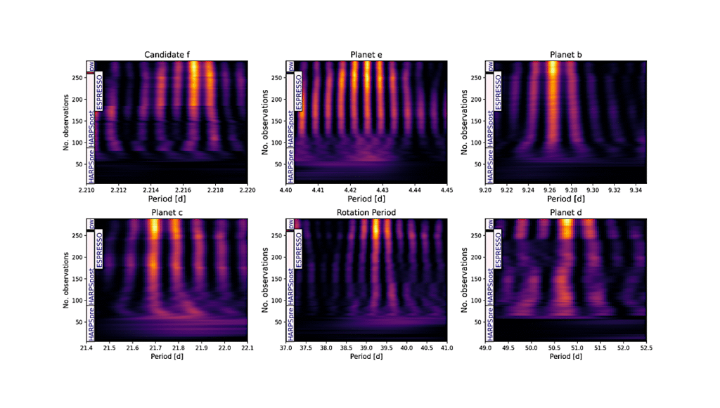
One such mathematical tool is called a periodogram, which searches for repeating signals in the data — displayed here as prominent peaks — that indicate the presence of a planet. The graph on the bottom panel shows the periodogram for the new data. The first signal (in white) corresponds to Proxima b. The second set of possible periods (in red), of around 200 days, are produced from patterns seen in the top panels. The presence of multiple peaks of similar heights means a signal cannot be precisely pinpointed and that its origin remains unclear.
The project will continue acquiring measurements until the end of September this year. You can follow along as the Red Dots campaign unfolds and even contribute observations via the Red Dots website, Facebook, or Twitter accounts.


